COLOR (IN)TOLERANCE
- May 22, 2020
- 2 min read
Updated: Aug 24, 2020
If you had read my neutral monochrome post, then you would have known that I have color intolerance. I'm a new neutral monochrome believer, and I feel good about it. Nonetheless, every now and then, I see a color-saturated project so inspiring, that I consider converting again to the normal mode of living at peace with colors.
KlunderBie, an art direction and photography studio, master color. Their work, wide colorful surfaces occupied by mysterious objects and shadows, arranged in an angular geometry, brings to mind a superposition between Magritte and Mondrian. Check out their Instagram account, it's a real treat!
Above is a classic Haussmannian Paris apartment, reinterpreted by Hélène Pinaud and Julien Schwartzmann of Heju Studio. That tiny corner detail, zooming in on the ceiling cornice and walls, captures the whole design concept in one image. You can tell from that detail alone that the clients are graphic designers, because that spot looks like a beautifully articulated poster.
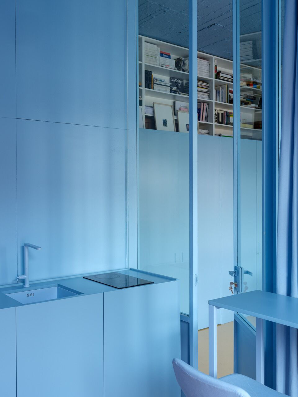
Russian artist and architect Harry Nuriev, founder of Crosby Studios, uses in each one of his interior design projects a different distinctive color, and this bold monochrome practice became his trade mark.
The unique color pallet, chosen by AZAB architects for this Spanish apartment, was driven from the original features of the building, and meant to spread serene atmosphere and optimism.
Colombo and Serboli Architecture were in charge of a budget-friendly renovation of a fire-damaged apartment in Barcelona. Their work focused on simple aesthetic alterations, and What's more simple and affordable than paint?
Last, but not least, is a green bedroom in a forest cabin, inspired by the colors of its outside surroundings.
So where do you stand? Neutral Monochrome or Color Opulence? I take the Fifth for now.


Comments